Statistics For Coastside Real Estate
As a finishing touch to the very interesting year of 2017, here’s a look at how the San Mateo County Coastside communities fared in the world of Real Estate. With about 550 transactions (and for this discussion I’ll be focusing on Single Family Residences (SFRs)), about $640,000,000 changed hands – an impressive number. Let’s look at transaction data from the MLS to find some local trends of interest.
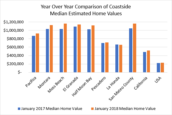
The following graph shows a comparison of estimated home values (from MLS and public records) for the Coastside, separated by community and compared to San Mateo County, all of California, and the entire US as well. Broadly, home values have increased by a few percent over the previous year. Whew! That’s a relief to hear after a very turbulent year, but not really a surprise if you have been following the local market closely. San Mateo County has high property values by any measure, especially when comparing to the statewide and national markets.
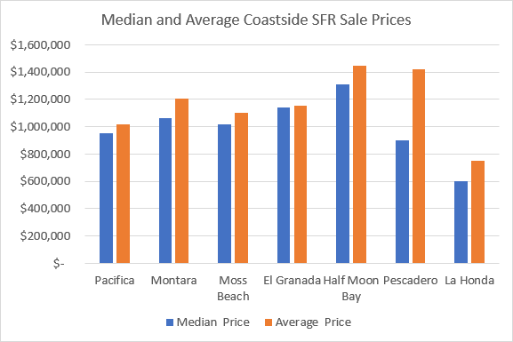
Let’s look at the median and average sale prices for SFRs by community for all the sales closing during 2017. The Median figure indicates the price point at which half the transactions are above, and half are below the specified dollar amount. The average simply adds all sale amounts and divides by the number of transactions. While medians are the most commonly cited data, the differences between median and average values can indicate if a local market is skewed to the lower or higher end. In the graph below, for example, we see that Pescadero (with 5 transactions) had a couple of high-end sales that pushed the average much higher than the median. Statistically, it is easier to skew the difference to the higher end than to the lower.
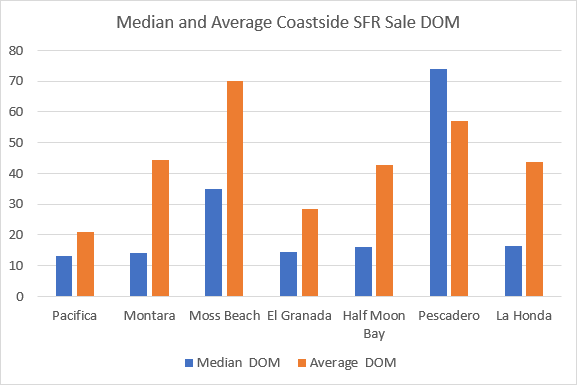
If you are considering selling your home, it is natural to wonder how long it might take to find the right buyer and close a deal. There are many factors to consider – location, size and price of home, timing of market entry, proximity to the beach, view, etc. I won’t be isolating for each of these variables in this post, but we can take a quick look at the fundamentals of Days On Market (DOM) for each local community. You can see that the differences between median and average values are quite different – indicating that there is quite a large range in the DOM figures. Some arms of the market are moving much more quickly than others.
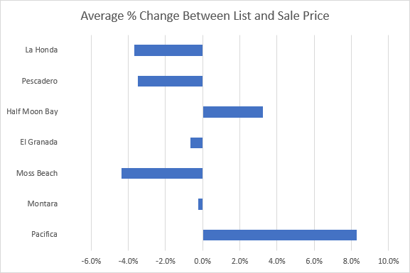
The decision of how to price a home for sale is always a balancing act – how quickly do you need to sell, how important is a specific price point to recover investment costs, volume of competing inventory, and even determining your motivation to sell – these all must come together to establish your market entry listing price. The bar plot below shows how homes in each community fared when comparing the original list price to the final sale price. A negative value (to the left of the zero line) indicates that the sale price was less than the asking price. A positive value indicates that the sale price was higher than the listing price.
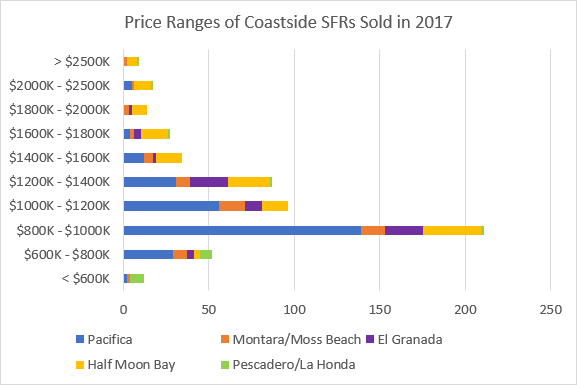
Finally, we can look at the number of sales for homes in given price ranges. The following bar graph shows ranges with the bars showing cumulative contributions by community toward the overall data.